
I agree with Bayu, the original logo is better, simpler and cleaner. I would also get rid of the additional snake head and agree with the assertion that 'Watches for Medicine' is a better slogan.
Hello everyone,
- All the Doplr watches which were ordered in 2017 have now been dispatched. There are only a few models still available until the next delivery in June 2018.
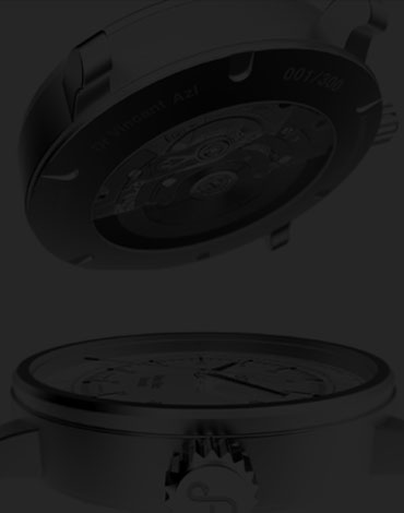
- We would like your opinion about the logo:
![]()
- We plan to incorporate a new logo with the slogan Doplr “Watches for Medstyle” or "Watches for Medicine"
Which one do you prefer? Current (1) new (2)
- Please send us your comments below!
- A summary of everyone’s views is scheduled for the 11/02/18
Best regards,
The Doplr Team.
8 comments
Jack - le 4 February 2018 
Doplr - le 4 February 2018 tks Jack! best Doplr TeamZsolt - le 4 February 2018 Hi Team! I prefer the older version! Simply, elegant and perfect! Thank you for your interesting of my opinion!Doplr - le 4 February 2018 Thanks for your answer Zsolt! Best, Vincent, Doplr TeamRaymond - le 4 February 2018 Logo is unique and cool. Prefer 1 over 2Doplr - le 4 February 2018 Thanks for your answer Ray! Noted. Best, Vincent, Doplr TeamBayu - le 4 February 2018 Dear Doplr Team, I prefer the first logo (1) on the watch. It has perfect curves like sound waves that is aesthetically pleasing. It gives the watch a sense of modernity to a very vintage technology. As an advertisement, however, there may be one too many snakes. Remove the snakehead on the letter ‘d’. As for the slogan, as a native English speaker, ‘Watches for Medicine’ sounds more natural. You’re promoting a watch to a niche crowd. There’s no point using the term ‘Medstyle’ if you’re selling one item.Doplr - le 4 February 2018 Thanks for your answer Bayu! Yes I agree for "Watches for Medicine" instead of "MedStyle". Best, Vincent, Doplr Team